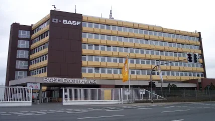
BASF have launched a new logo to cover all the company’s manufacturing divisions.
The new logo consists of two components, the squares and the letters BASF. According to the company: ‘The four letters BASF stand for our strengths and tradition that will go with us as we move into the future. The two squares symbolise partnership and smart solutions. One square is the other’s counterpart and each complements the other.’
The new logo has been produced in six colours. In contrast with business with only one single corporate colour, BASF say their six colours will be used on an equal basis in their communications media. They should not be assigned specific meanings or used for colour-coding. The varied usage of these colours is said to express the innovation and flexibility that the BASF brand represents in all spheres of activity.
Below the letters BASF is the wording ‘The Chemical Company’. BASF say that this asserts their claim to be the world’s leading chemical company and supplements the BASF logo.


